This was basically just for fun, the real piece just has flat color background, no texture.
It's some interior album art for this children's album by an independent recording artist in Nashville, TN. Visit my main blog and dig around in the recent past for more posts on the artwork for this project.
I threw a watercolor texture over it and played with the layers.
__________________________________________________
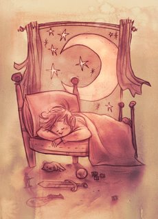 Here's what I ended up with.
__________________________________________________
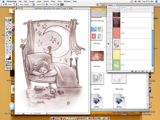
This is the orginal drawing. A lot of smudging the pencil around, so it's got some texture already. I picked out a few highlights with a layer of Screen but mostly, this is the original.
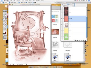
I put a layer of Color over it, and turned down the opacity just to change the color of the lines.
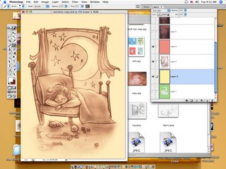

Just messing, I did another a layer of yellow to warm it up.
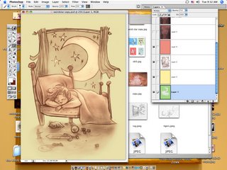
And added a layer of a green to the background, the boy and the bed erased out.
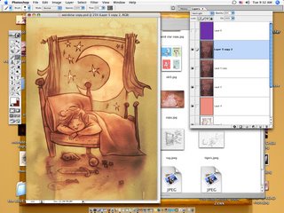
This is where it starts to look cool~ I dropped in a scanned watercolor texture I had made and copied a couple times, setting it to Hard Light. Experimentation is the key for this. It's a weird layer setting.
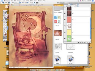
Then, just to nudge the color a bit, I dropped a layer of purple Soft Light over it all.
Pretty simple, but I think it looks cool. To me, a realistic texture and traditional feel is what gives digital work credibility.
__________________________________________________
Read More...

0 comments:
Post a Comment