Dear folks, I have been very deliqwent in letting TPE go so bad, and I do apologize to the faithful daily checkers (I know you are out there, I have a Stat Counter :)
Work has been very busy as of late, however it has paid off and as a direct result, a sizeable amount for an equally sizeable job just came through and I am blogging to you via a lovely 20 in. iMac. It is quite a step up from the 15 in. eMac I worked on for 4 years and I am very pleased.
In anycase, I dug and dug and found that I have TWO scarecrows and in layers, so here they be. In all their looking for trouble scariness:
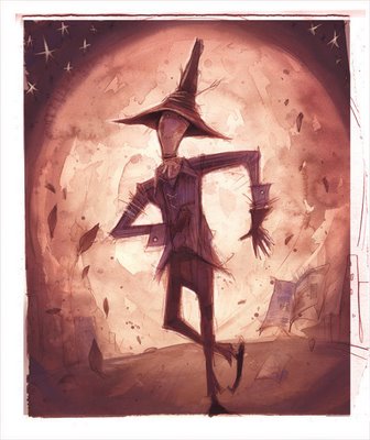
Click all both the pictures above and you can download the .PSDs and look through the layers at your leeeeeeizzure. Feel free to ask any questions and I'll do what I can to answer them.
~enjoy,
the deliqwent proprieter of TPE.
Monday, October 9, 2006
dear folks, + the promised scarecrow(s)... in LAYERS!
Thursday, September 14, 2006

Friday, September 1, 2006
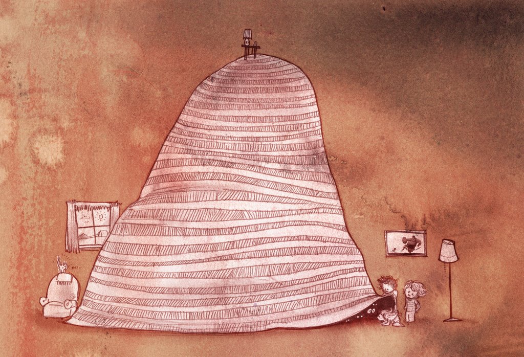
Pumpkin Pumpkin in the Sky
This started as a little watercolor that I did for a story for my then girlfriend, now wife. If you want to see the rest of the pictures in the story, click here for Peter, Peter: a Story in Pictures.
It just might give this a little more context.
 _______________________________________
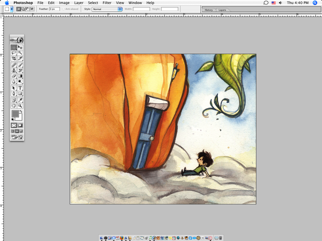
Above is the original watercolor. Taped to a board with tape and painted with real Windsor-Newton watercolors and brush. That was a while ago, but the other day I wanted to finish it.
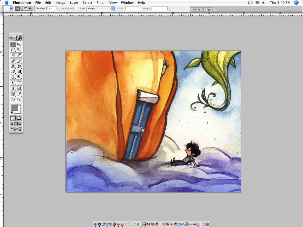
Added some blue to the clouds with Multiply.

Then I put in some warm highlights to the clouds with Screen.

Added a shadow around the image with Multiply. Just seemed to warm it up.

Put in some more blue value in the sky with Multiply.

Then I unified the colors with a layer of Color and turned the opacity way down, like to 30% er something.
I dropped in a watercolor texture in Soft Light...

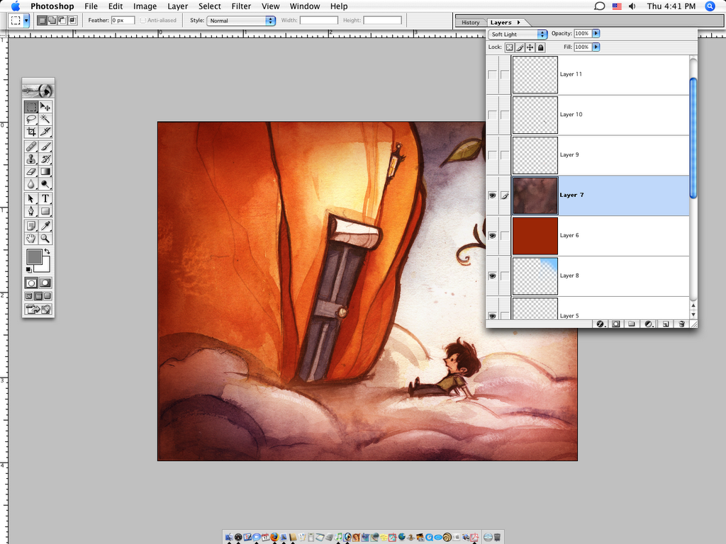
And done. At some point I dropped in a paper texture and turned it down low: http://www.mayang.com/textures/
They have good quality pictures and textures.
By the end I usually flatten the picture and take a copy and work right on it and touch things up. I changed his face a little and touched in a few highlights. Read More...
Monday, August 28, 2006

Friday, August 18, 2006
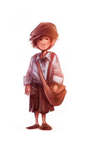
The boy~ with color
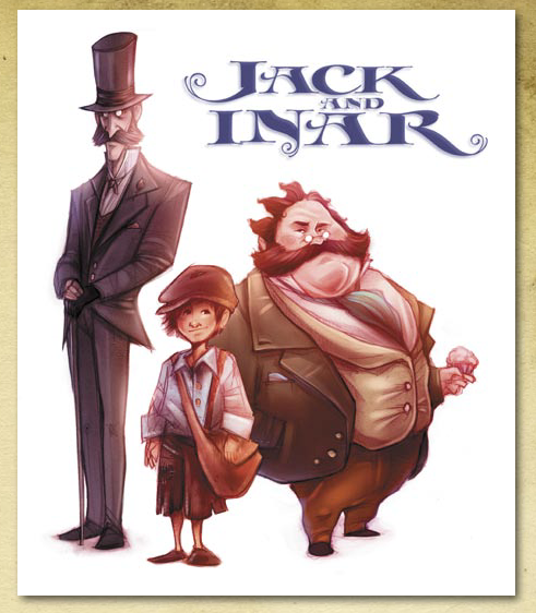
The context for the boy. He is the "Jack" of Jack and Inar, a book of my own writing, nearly finished. Inar not being pictured here. To Jack's left is Dr. Arthur Loveless and to his right is Adolphus M. Grimble.
In anycase, Jack always carries two matches in his pocket.
But that's not why were here.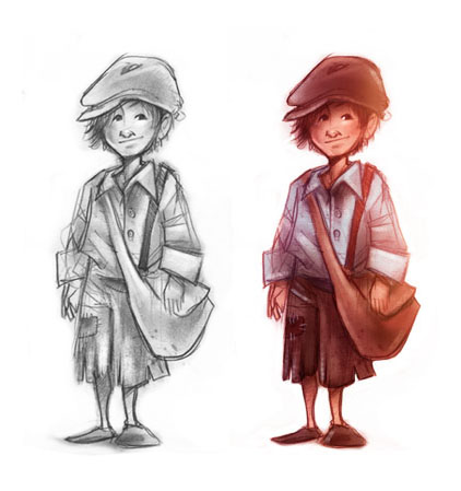
Jack. With and without.
And then here....
Ok, the above picture, I colored his face/hands w/ a layer of Multiply and over it all layed a layer of a warm, dull red layer of Soft Light.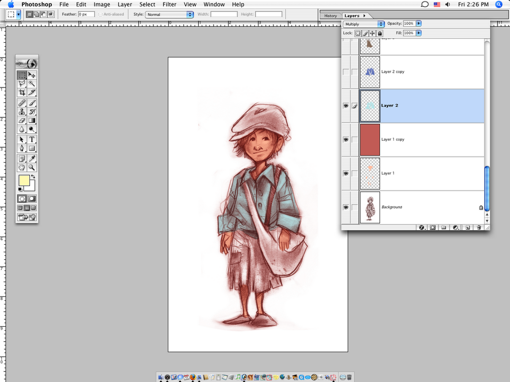
Here's what throws people. I colored his shirt in Multiply....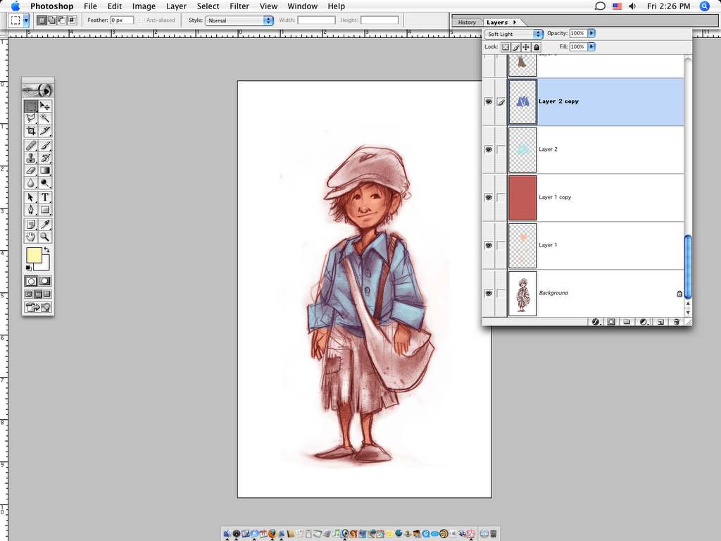
....copied the layer, changed the setting to Soft Light, made the color a little darker and redder. That's about it. For some reason everyone I've ever shown that too in real life has not believed me.
The hat and the pants followed the same idea of the shirt as far as coloring go.
A layer of Color with the opacity turned way down to unify the colors.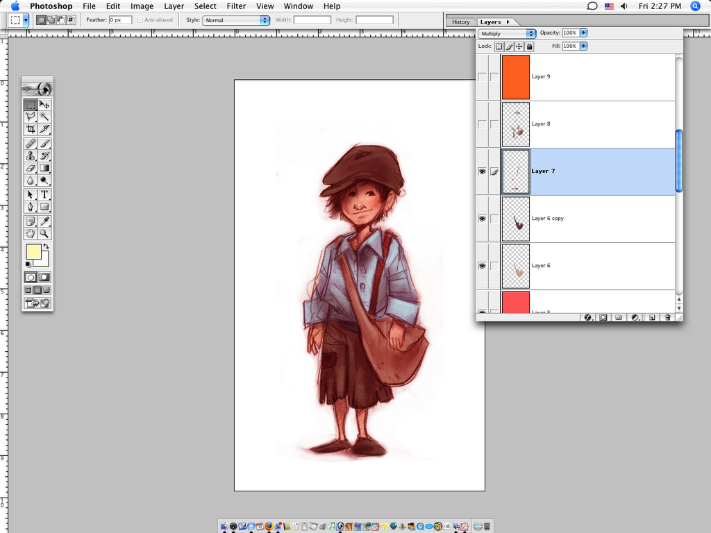
Colored the bag and such.....
Added shadows in Multiply.
More color balancing...
Cleaned up the edges with a layer of Screen.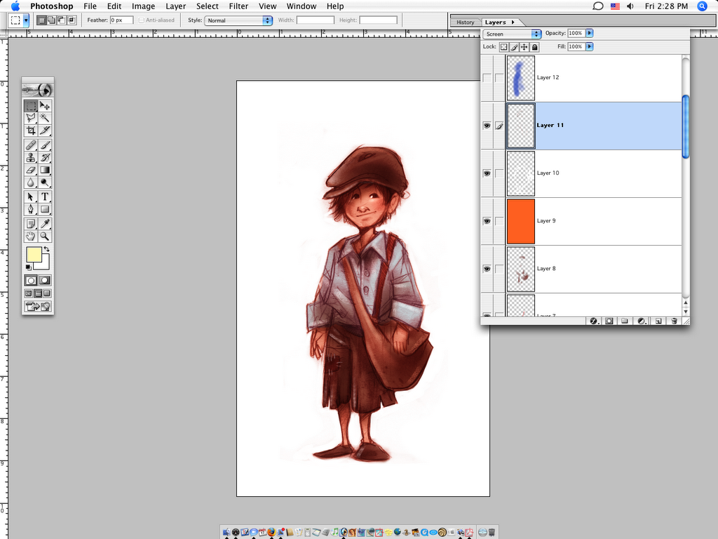
Added some important highlights in Screen.
Notice the blue layer, and the warm red, both are Screen layers. Lighting.
And just another layer of a way low opacity Screen layer of orange for lighting.
And that's about it.
Thursday, August 17, 2006
This Friday [tomorrow]:
The demo of a quick one. I think it took all of 20 minutes.
Hopefully I'll be able to explain the weird way I color things with alternating Multiply and Soft Light layers because everyone I have talked with in real life and tried to show has always looked at me funny and walked away. Oh well.
Friday, August 11, 2006
Jesse's Song
This was basically just for fun, the real piece just has flat color background, no texture.
It's some interior album art for this children's album by an independent recording artist in Nashville, TN. Visit my main blog and dig around in the recent past for more posts on the artwork for this project.
I threw a watercolor texture over it and played with the layers.
 Here's what I ended up with.

I put a layer of Color over it, and turned down the opacity just to change the color of the lines.

Just messing, I did another a layer of yellow to warm it up.

And added a layer of a green to the background, the boy and the bed erased out.

This is where it starts to look cool~ I dropped in a scanned watercolor texture I had made and copied a couple times, setting it to Hard Light. Experimentation is the key for this. It's a weird layer setting.
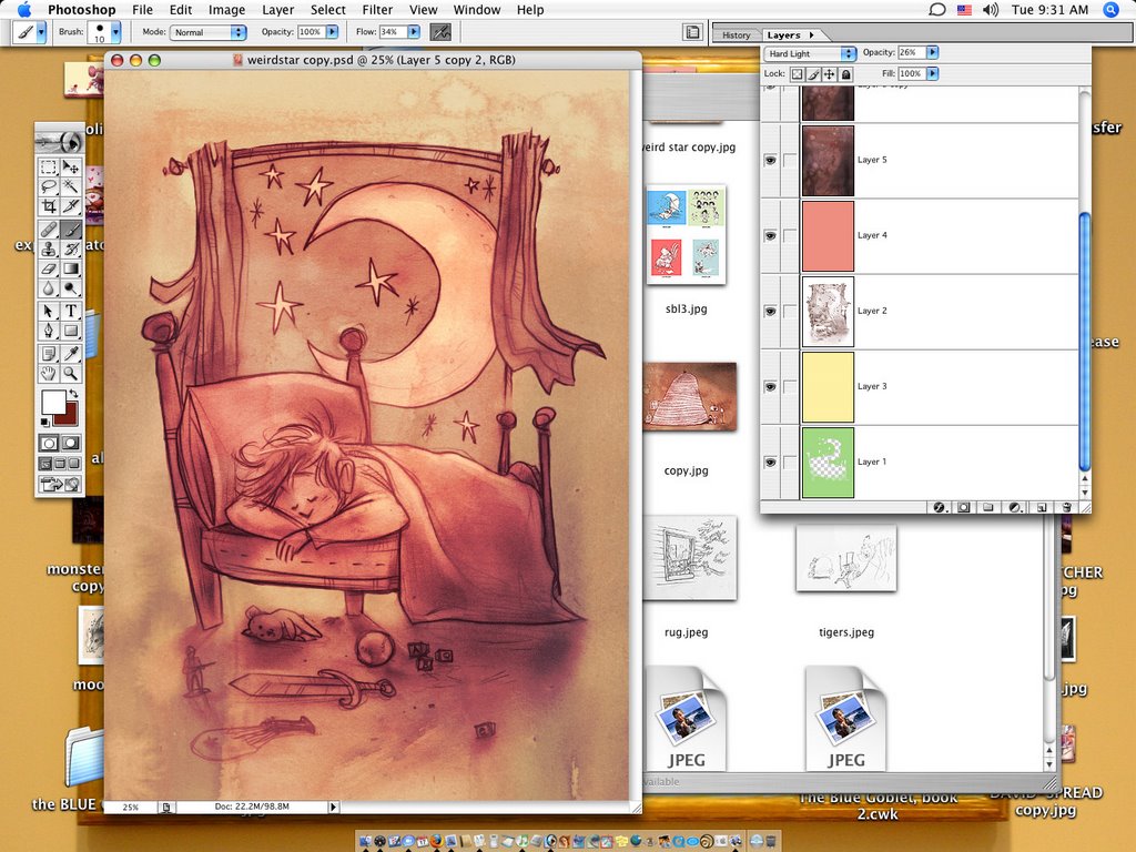
Then, just to nudge the color a bit, I dropped a layer of purple Soft Light over it all.
Pretty simple, but I think it looks cool. To me, a realistic texture and traditional feel is what gives digital work credibility.
 Here's another piece for the same album that I did basically the same texture work to.
Wednesday, August 9, 2006
Coming soon
Sorry I've been out and neglected the poor Experiment. Do forgive.
New demo coming this week:
Check back Friday.
Thursday, June 15, 2006
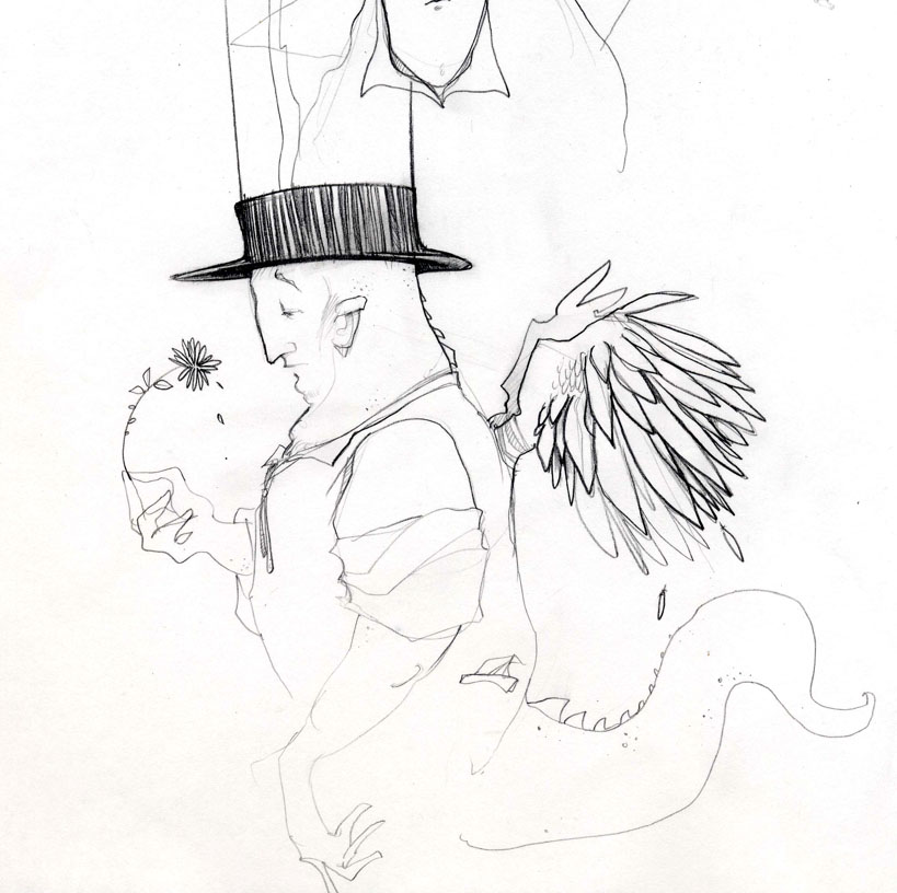
a little bird watching

The Bird Watcher has its roots back in a weird drawing I did in college (below) of a troll with wings and a top hat. I always liked it and just wanted to do something with it again.
-----------------------------------------------------------------------------------------------------------
So, another doodle. There was a lot of these but this was the most... appropriate. I think.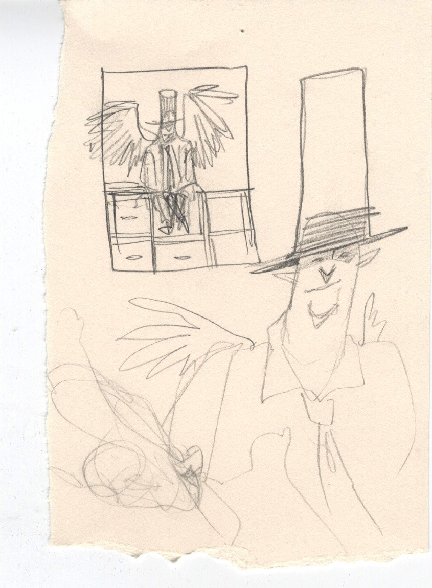
And then the drawing to scan.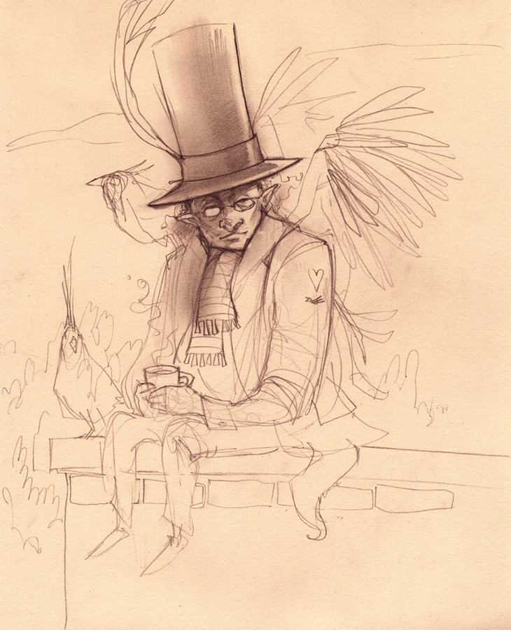
And this is where you will just have to believe. I don't have a file with the layers, so, oh well. just believe it. Geez. It was probably just mostly a lot of Normal and Multiply with some Softlight for color. Plus a beard.
Adding shadows w/Multiply... Notice Justin wearing the hat reference.
and the face. boo.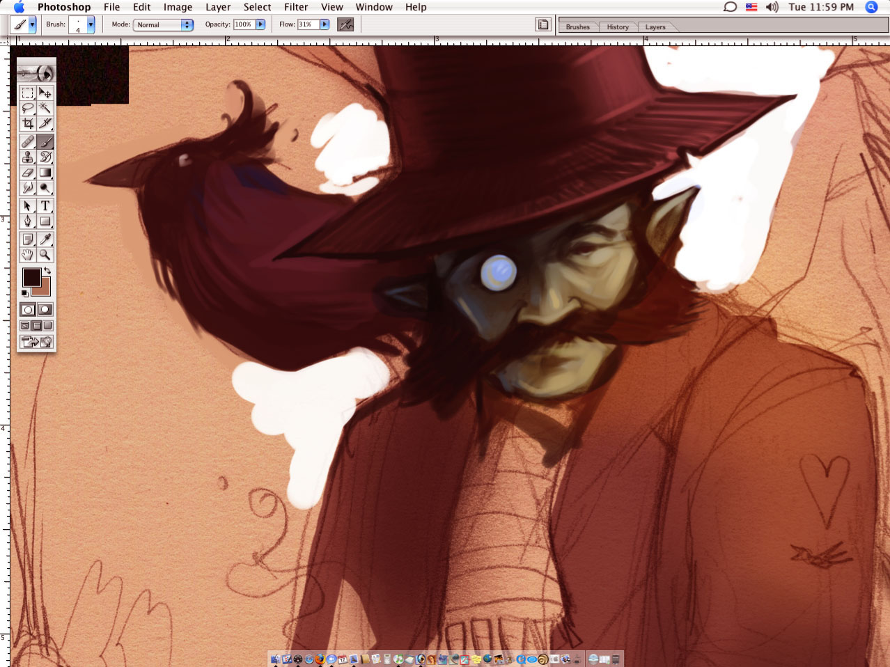
Here's some softlight of yellow on the right for some sunny joy and some blue on the left for... whatever.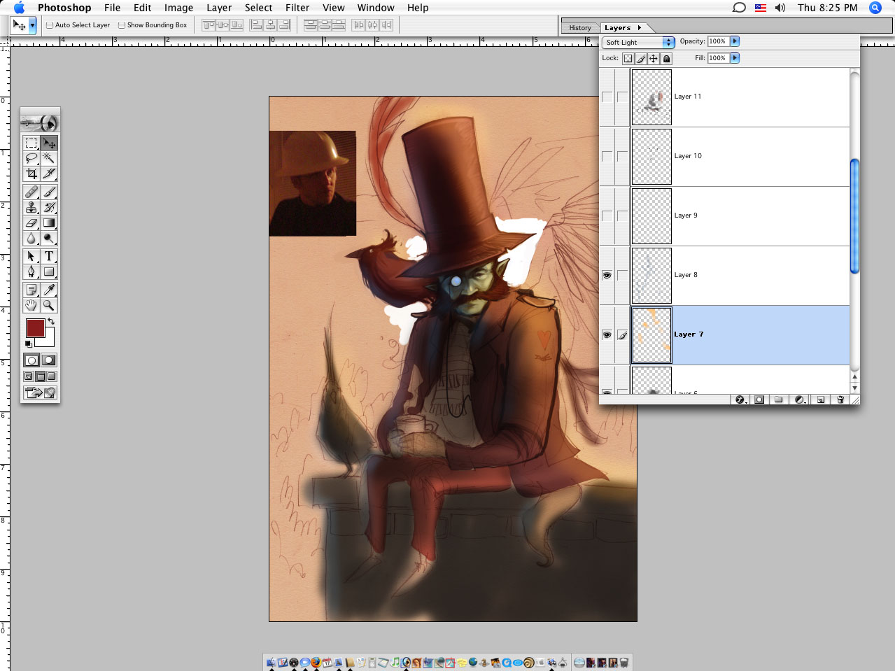
more shadows w/Multiply..... plus a probably a little line drawing.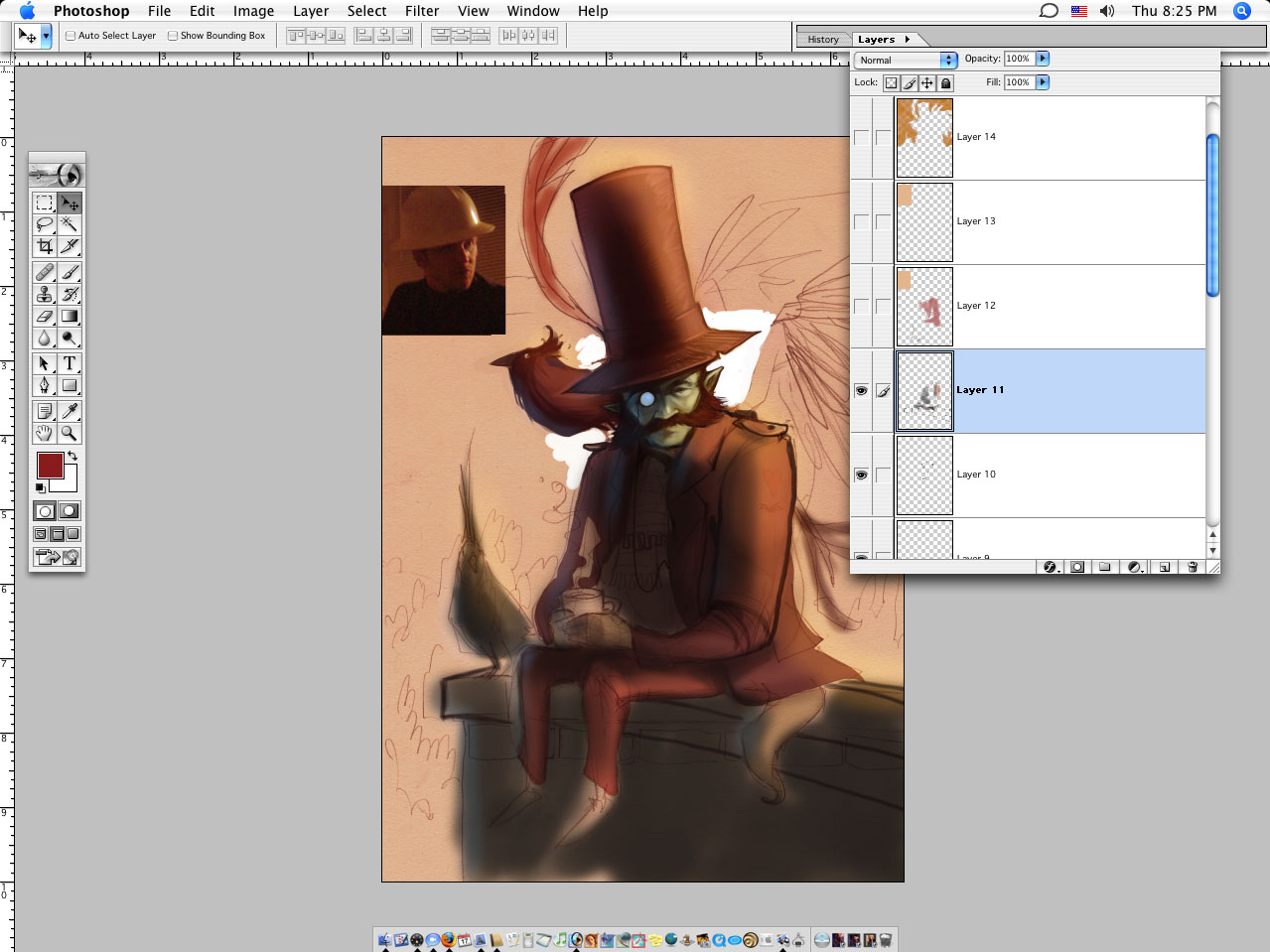
and.......... why not.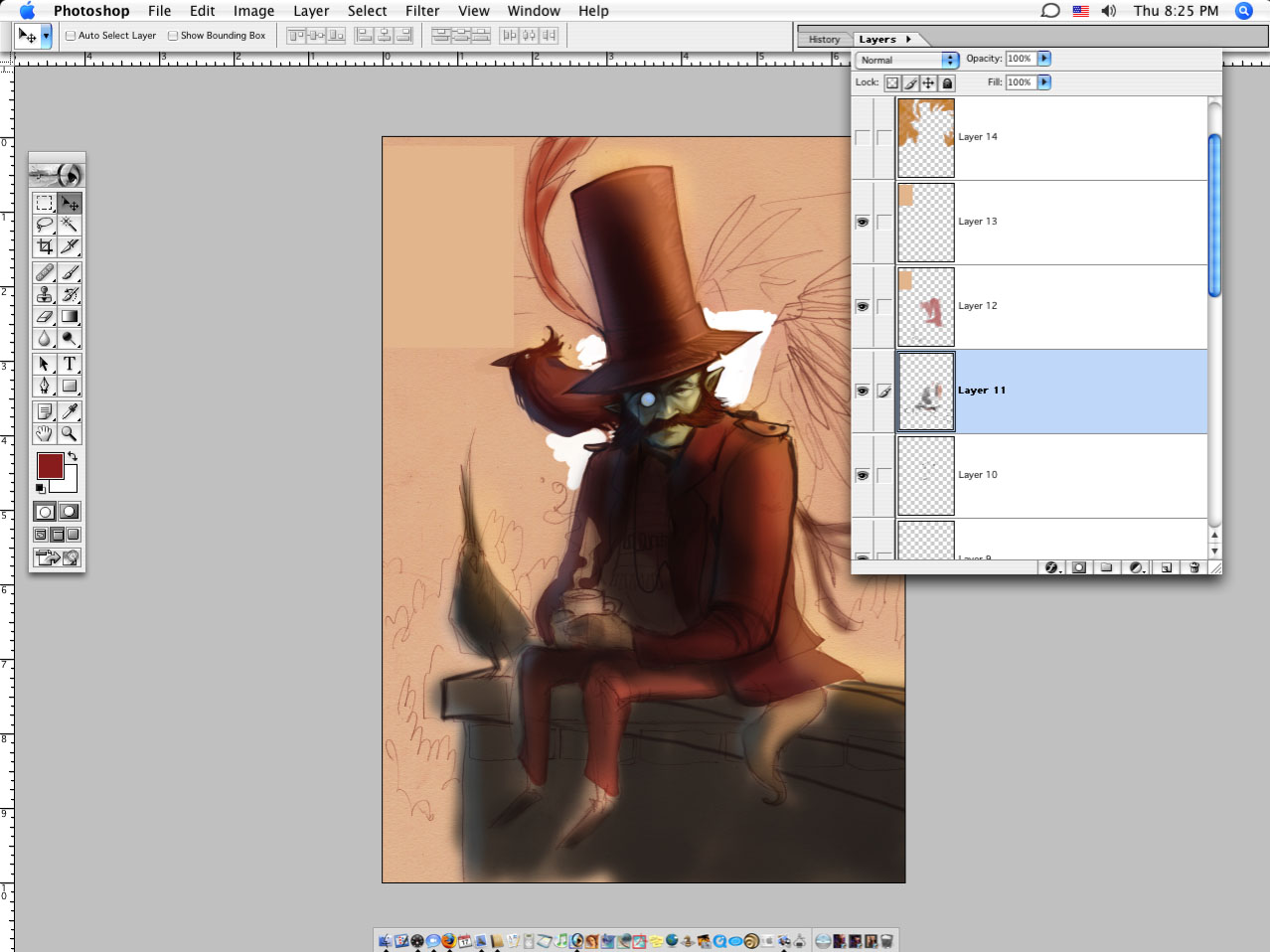
Now, more reference. Notice too that I make the canvas really wide for... whatever reason. I just do. In any case I can put my reference on there and pull colors if I like.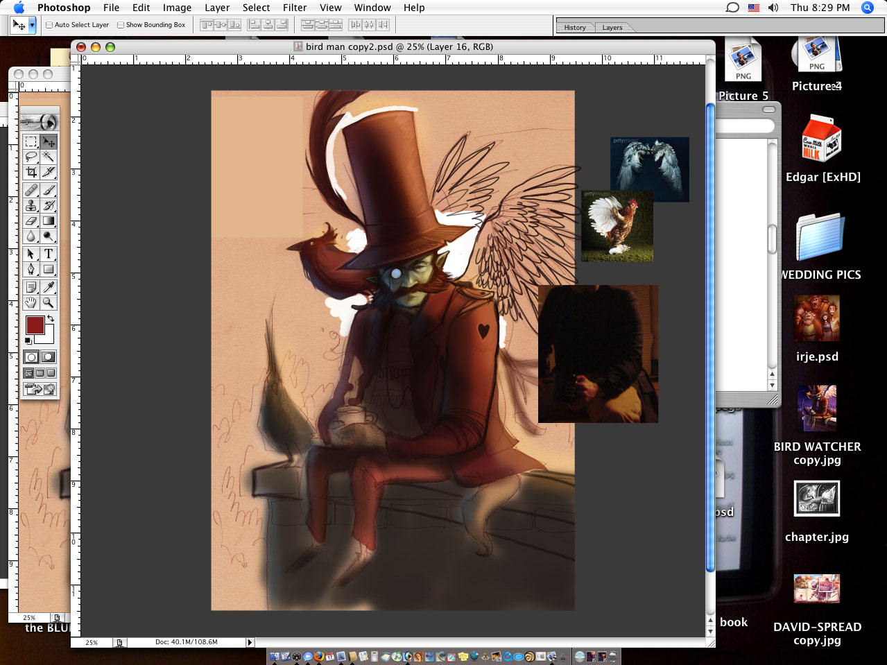
Working on the arm with Multiply...
Painting the folds in the sleeve here, with a layer of Normal.
And tightening things up, w/Normal. Basically just drawing over things till I like it.
don't freak out. the hat is about to change. I use the Liquify tool from time to time.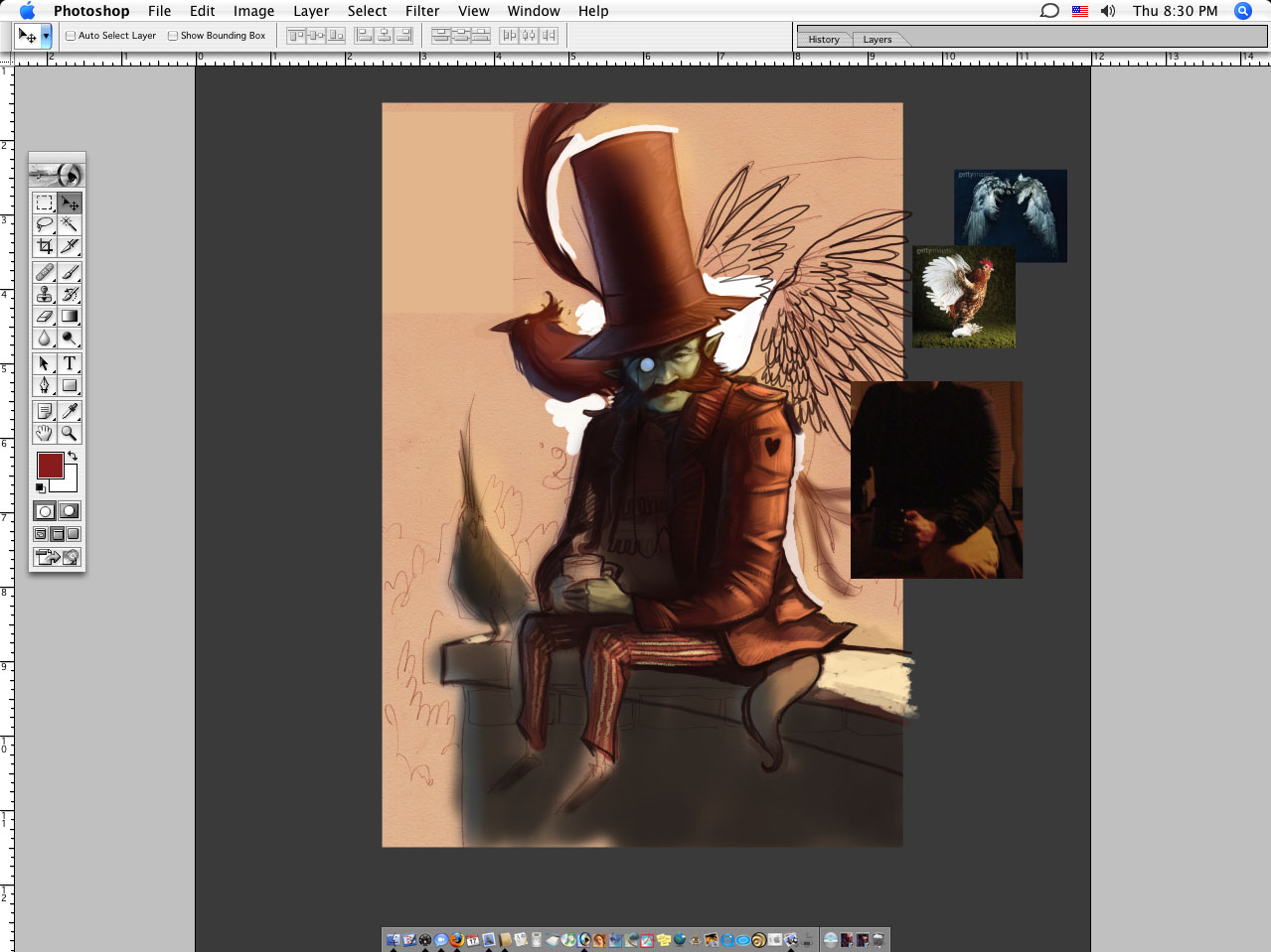
Hat + scarf.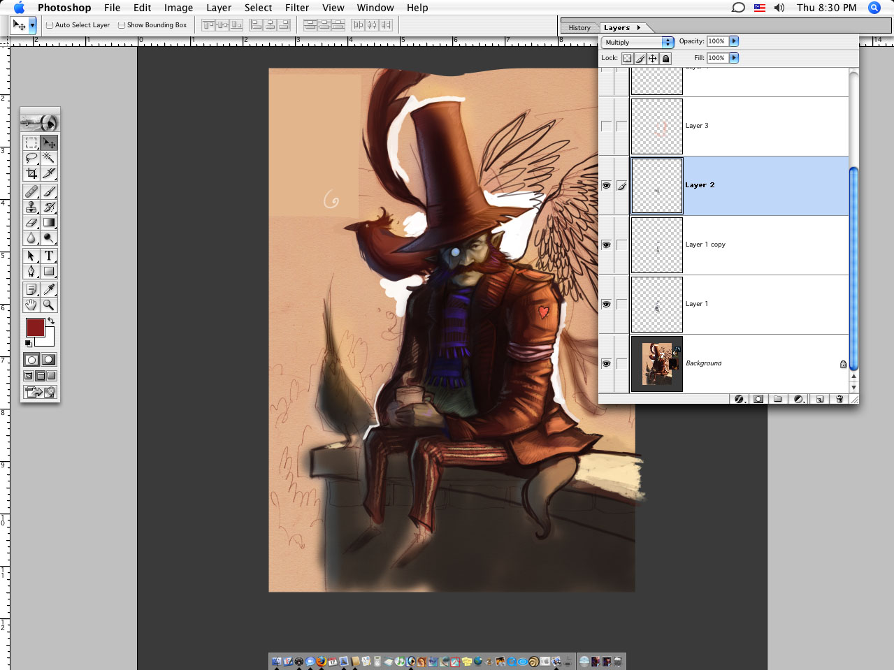
And highlights on the scarf....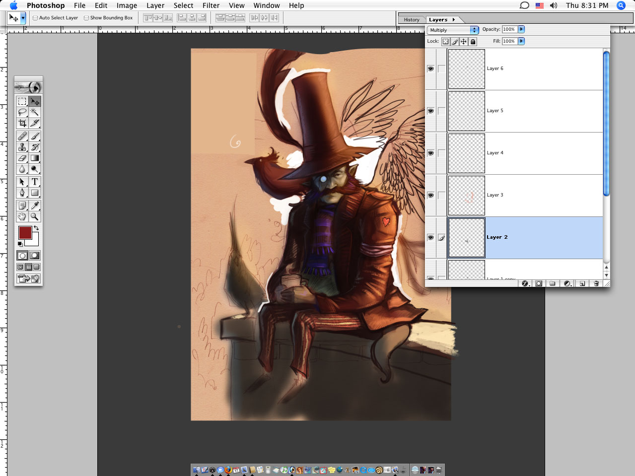
Just the sky. I wanted it to go from warm to cool, added on a Normal layer. And the bricks were probably a lot of layers of Normal.
HIGHLIGHT on the rim of the hat. For me it is moments like this that make everything worth it.
BLAM- we got shoulder bird. Just careful brushing and some various layers of Normal and Softlight.
I like to do a color w/Multiply over it sometimes because it seems to hold things together.
Darks in Normal.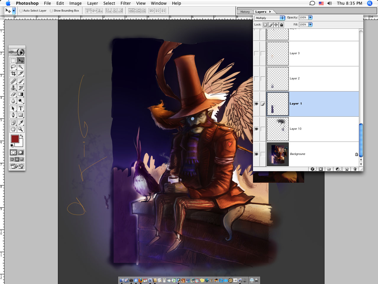
Screen in some highlights unless you are that guy who can't handle it.
Just cleaning up w/Normal
Yellow bushes... put there with Normal, and darkened with Multiply.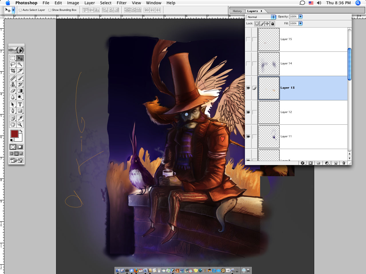
Screen in the blue in the sky (unless....)
KABLAM~ and there was dark.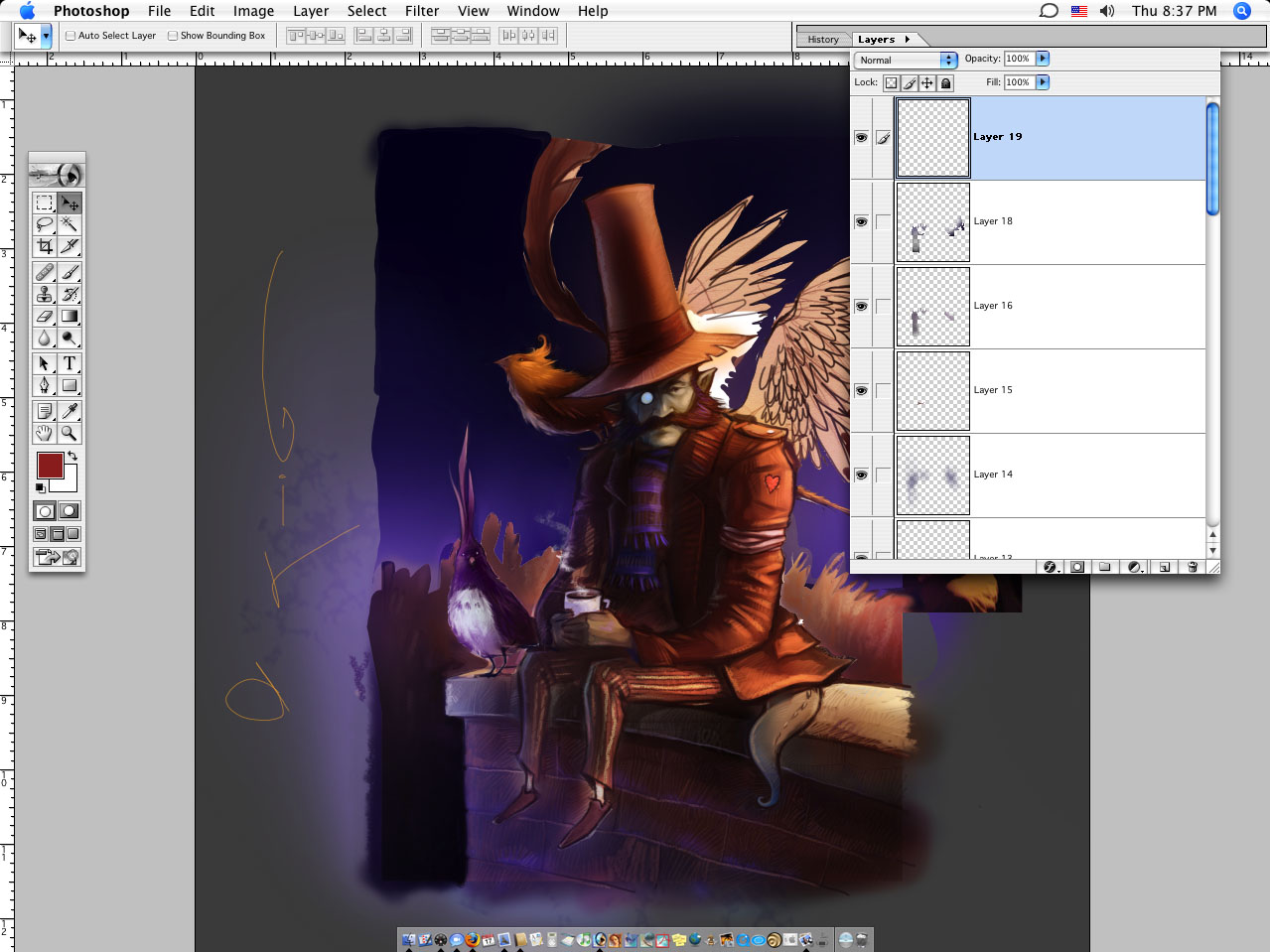
And then, just a textured sky. And a city. Oh yeah, and I did the wings. Again, probably just a lot of Normal and Softlight with a textured brush.
The Bird Watcher.
Ads